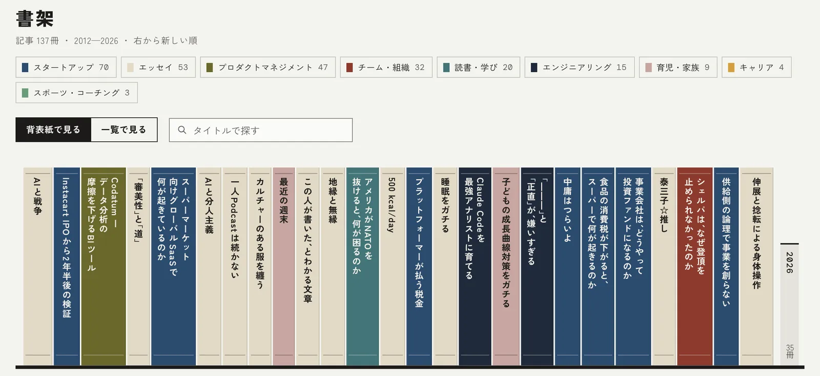
I've redesigned yamotty.me as a bookcase. The 137 posts I've written since 2012 are now lined up on shelves as book spines, and I've renamed the newsletter Shoka Dayori (Letters from the Bookcase).
Why a bookcase
This site brings together 14 years of blog posts alongside updates from elsewhere, like my podcast. By sheer count, about 80% of the content is podcast episodes, but the blog has always been the core of it.
Until now, posts and podcast episodes were laid out in a single timeline, newest first. That made the latest content easy to find, but it hid just how much I'd accumulated over 14 years. With a bookcase, the number and thickness of the spines make that accumulation visible on their own. Even 2013 to 2015, when I didn't write a single post, shows up honestly as empty shelf space.
At the same time, too much visual flourish gets in the way of actually reading. So I kept the spectacle to a single spot, the bookcase on the homepage, and made the individual post pages quiet: just a table of contents and a reading-position indicator.
What I decided together with Claude Code
I built this with Claude Code.
The first thing I asked for was a design ambitious enough to win an Awwwards (an international web design award). Using the site's actual post data, Claude Code produced three directions: a polished version of the existing design, a tree-ring layout with every post arranged in concentric rings, and the bookcase concept. We compared the designs and went back and forth on feedback through Artifact, Claude's shareable web page feature.
These days I run just about everything through Artifact when talking with Claude, whether it's a report for work or a product I'm building and implementing entirely on my own, and I genuinely think it's a game changer.
One of the more amusing things Claude did was grade its own work: once a design was assembled, it showed the screen to a separate judging instance without telling it the design intent, and had that instance score it using Awwwards' own rubric.
We went through five rounds of fixing flaws and re-scoring. The best we got was 7.53, short of the 8.0 target, and Claude itself reported that the weak point was the finer details of Japanese typesetting.
I thought: this thing is really good at staying in character.
Design decisions worth noting
-
Spine thickness is proportional to the square root of the character count. I originally wanted it directly proportional to length, but the median post runs about 3,000 characters while the longest is around 18,000, nearly a 6x gap. Scaling directly would have made the long posts absurdly thick, so, well, we ran into a bit of uncertainty there, lol.
-
Color is set by a post's first tag. I assigned traditional Japanese colors to the nine tags, things like indigo (ai), unbleached (kinari), bush warbler green (uguisu), and red ochre (bengara), choosing shades that keep at least a 4.5:1 contrast ratio against the spine text. Newer books sit further to the right.
-
At the end of each post, I added a colophon and a newsletter sign-up form styled like a reader's registration card. The idea is to recreate that moment of finishing a book and picking up the postcard tucked inside.
-
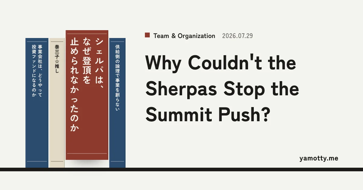
The same spine artwork also gets reused for the cover images shared on social media and for the newsletter's header image. The cover places the Japanese title vertically on the spine with the English title to the right, so a single image works for both the Japanese and English versions.
The hard parts of implementation
Every difficulty, without exception, came down to Japanese and vertical text.
-
The typeface I chose, Zen Kaku Gothic New, doesn't support palt, the feature that tightens the spacing around punctuation and brackets. Since CSS's automatic punctuation trimming doesn't kick in, I ended up wrapping each punctuation mark individually and tightening its spacing by hand.
-
Satori, the library used to generate the cover and email images, doesn't support vertical text. I had to stack characters vertically one at a time and swap in the vertical-writing glyph variants for punctuation and brackets.
-
The newsletter's header image was originally rendered on the server on demand, but on Vercel (where the site is hosted) the first render kept exceeding the 10-second limit. In the end, I switched to generating the image ahead of time, at the moment a post is published.
I feel basically no pull toward reading or collecting books. But I do take pride in the fact that I've written every one of these pieces with something like "I'm writing a book" levels of intensity, so expressing that through a bookcase design feels like the right call, and honestly, I'm pretty happy with it.
Comments
Share your thoughts or questions. Comments are published after approval.
Write a comment